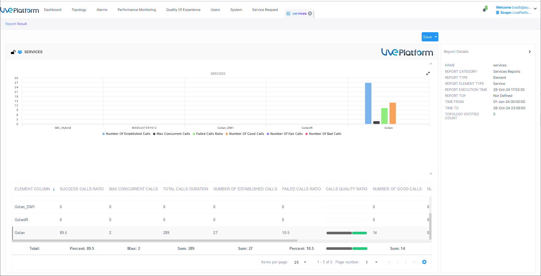
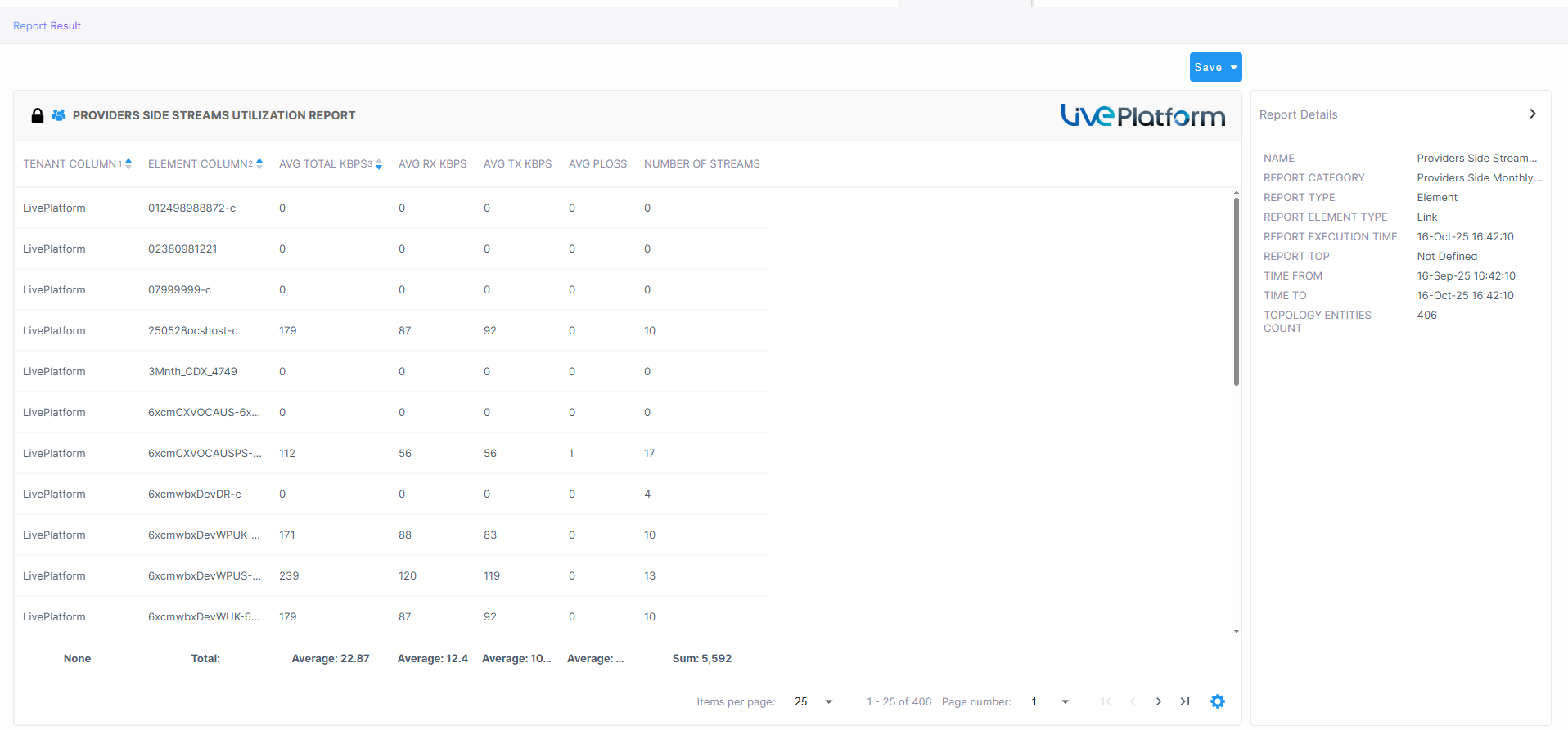
Element (Entity) Statistics Report Type
The following figures show example Element Statistics reports:
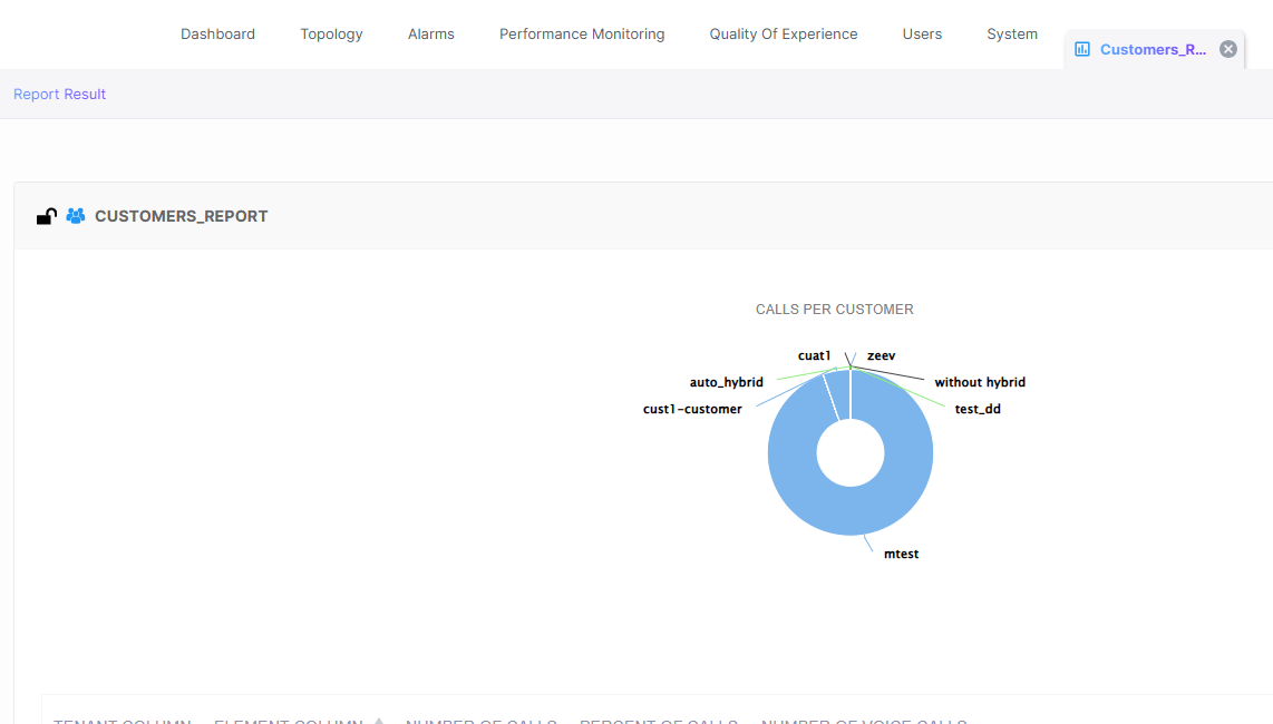
The following figure shows an Element Report for the 'Customers' entity.
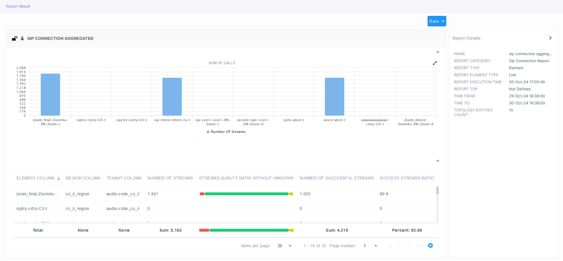
The following figure shows an Element report for the 'SIP Connections' entity.
Use the following to get acquainted:
|
■
|
Indicates a predefined report integrated with Live Platform; cannot be deleted or edited |
|
■
|
 indicates a public report; anyone can view, edit and delete it indicates a public report; anyone can view, edit and delete it |
|
■
|
'Devices Calls Report' indicates the defined name of the report |
|
■
|
Each bar in the chart shows the value (values, if it's a stack chart) of the metric, according to the chart legend: |
|
●
|
Red = Failed calls / streams (as shown in the preceding figure) |
|
●
|
Green = Successful calls / streams (as shown in the preceding figure) |
|
■
|
The y axis shows number of calls |
|
■
|
The x axis shows each device's name |
|
■
|
The Report Details pane on the right displays among other details: |
|
●
|
the defined time period |
|
●
|
the date and time the report was executed |
|
●
|
the number of entities in the topology |
|
■
|
The lowermost table columns shows the following: |
|
●
|
calls / streams quality ratio |
|
●
|
maximum concurrent calls |
Colors of bars in a stack chart depend on metric name. In the preceding figure, for example, the metric name 'Success Calls / Streams Ratio' contains 'Success', so the stack chart is green.
|
●
|
If the name of the metric contains 'Good' or 'Success', the stack chart will be green. |
|
●
|
If the name of the metric contains 'Fail', 'Bad' or 'Poor', the stack chart will be red. |
|
●
|
If the name of the metric contains 'fair', the stack chart is yellow. |
|
●
|
If the nameof the metric contains 'Unknown', the stack chart is gray. |